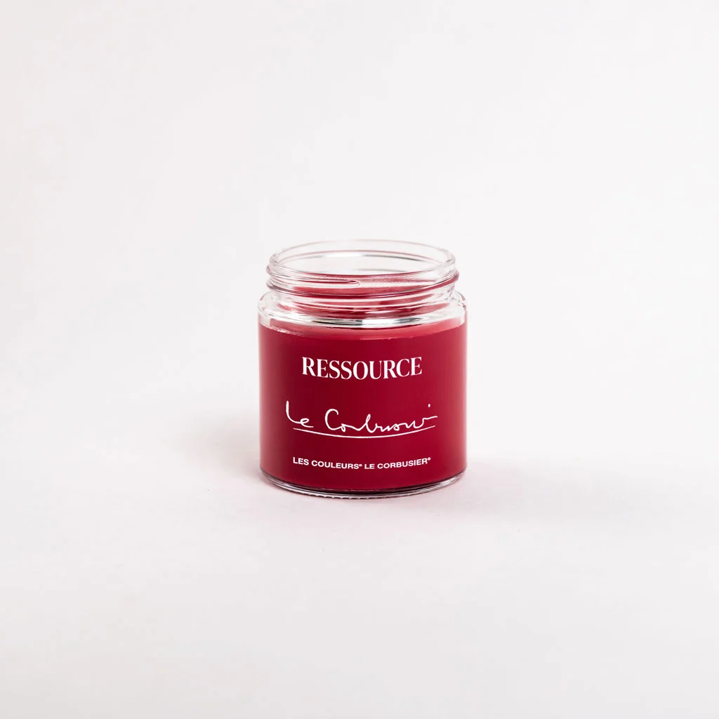
An interior begins to take shape before a chair is selected. The relationship between a wall, a ceiling and an opening can already establish where the eye rests and how one room connects to another. Ressource’s new edition of Les Couleurs Le Corbusier, presented in Paris in October 2026, gives those decisions a specific palette: all 63 colours of the architect’s Architectural Polychromy. 1
The system developed in two stages. The 1931 collection comprised 43 shades; a further 20 followed in 1959. Ressource has retained that complete range, making a historical body of colour available through a contemporary paint collection. Its catalogue also preserves the distinction between the two groups, allowing the palette to be understood as an evolving design language. 2
That history matters because a colour collection can be approached as a set of relationships. A designer choosing a wall colour is also deciding what happens beside a door, across a corridor and above a piece of joinery. Repetition may connect separate rooms; a carefully placed change can clarify the boundary between activities within the same space.

The practical translation is material. According to the launch announcement, the paints are made to order in Ressource’s Provence workshops. Modern Matte is intended for walls and woodwork, while Extra Matte provides a deeper, chalkier surface for walls and ceilings. Those applications make finish part of the composition, alongside hue. 1
A colour that moves across different surfaces still encounters different conditions. Daylight, artificial light and the angle from which a surface is seen influence its presence. For a project using this collection, the most revealing study would place samples at the actual junctions of the room: where a skirting meets plaster, where a window reveal interrupts a wall, where a ceiling begins.
There is also a useful discipline in working within a defined range. Sixty-three options leave room for individual judgement while encouraging a designer to remain conscious of an overall scheme. The range provides a manageable framework in which decisions about emphasis, continuity and proportion can be tested.
The value of a defined palette becomes apparent at the junctions of a room. A door can sit quietly within a wall or establish a visible threshold; a repeated colour can connect spaces that have different proportions. Ressource gives designers a new material route into those decisions, with the historical system available to be tested against the particular light and surfaces of a home.